
News:
PDF::Builder
v3.028 Released, 31 December 2025
Please also see the
CPAN listing, the
GitHub entry, and the latest changes list.
A Thought…
Those who think the past predicts the future are condemned to pick the wrong stocks.
— Scott Adams
User Interface isues
Posted on 2023-Jan-11 at 15:21:00 by Phil
Matters of the User Interface (UI) for a web page or application, and the entire User Experience (UX), have been beaten to death many times, yet designers still get it wrong. This can range from a poor choice of colors, to culturally-insensitive material, to poor handling of human names, to confusing parts of the interface.
OK, people like to design things that are different than what’s already out there, to give a unique and memorable look and feel. This is Product Differentiation, and while not a bad thing in and of itself, be careful! National and International standards and customary usages exist for a reason, and that is to have enough similarity between different designs that users can figure them out fairly quickly.
Imagine if automobile designers and engineers insisted on having everything about a car different from whatever else is on the road, just to be different? You arrive at the airport and go to the rental car counter. They hand you the keys to your rental (hire) car and you walk to it. No, you don’t get into the left front seat. It’s the right-rear seat! You look forward through a periscope, use a tiller on your left to steer, squeeze a lever on the door to accelerate, and push a button on the seat-back in front of you to stop. At least, the radio controls look familiar… hey wait, they’re up by the front seats! You likely would not be happy to have to drive this thing, because you would have to re-learn everything you knew about driving. Well, computer web pages and applications are no different.
In What’s in a name? I discuss issues concerning the handling of human names around the world, which I will not repeat here.
Posted on 2023-Jan-11 at 17:44:00 by Phil
Changing Languages
Most web pages are single language, such as English. Although non-English speakers might appreciate being able to switch to page content in their own language, it’s still a lot of work to do a good translation, and it often simply isn’t worth the effort. Perhaps some day automated on-the-fly translations will be commonplace, and no one will think about the issue, but for now…
Anyway, this posting is not so much about how and when to translate a page, and more about how to let the user know that alternative languages are available. It’s harder than you think! The simplest case is not having any alternative languages — you simply say nothing about the matter!
If you have one alternative (or alternate) language, probably the best solution is to place a text button somewhere near other settings changes (usually at the top, but sometimes at the bottom) that gives the name of the other language, or, better yet, a phrase “Switch to ______”, in that language. For example, your primary site language is English, but you want to offer Spanish too, to get a larger audience in the U.S. and most of Latin America. The site may come up in English (unless you can figure out where the visitor’s IP address is coming from, and choose the appropriate language), and you want to make it easy to switch to Spanish. The text button for this, colored to contrast with other controls and draw the eye to it, would say “lengua Española” or “Cambiar a idioma español” or something along those lines.
A Spanish-speaking visitor should quickly spot this button, as it’s in the expected area for a control, and is able to read it because it’s in their language. Do not assume that this visitor will speak English, and know what “Spanish” or “Switch to Spanish” means. On the Spanish page, there would be button in the same place that says “English” or “Switch to English” — in English. This user, even if they don’t know a word of Spanish, will be able to safely return to the English page. Perhaps they were idly poking buttons or something, and ended up on the Spanish page. No harm done.
Now, what if you have multiple languages (more than two) available? If you have only three or four, it might be feasible to list them by name some place on the page (not with country codes or flags!). More than that, and you should be using a selection (drop-down) list. Each entry in the list should be the language name (e.g., “Español”) in that language and alphabet, not in English (e.g., not Mandarin transliterated into the Latin alphabet, if at all possible). The big question is then, what do you label your drop-down list with? Usually there’s some sort of default text entry, such as “Select a language”. The problem with this is that all your users need to know English in order to find their own language! There’s not enough room to put even a sampling of available languages in the default text field. Even if you pick the language of that particular page (“Select a language” in English, “Selecciona un idioma” on a Spanish-language page, etc.), it still is of no use to someone who can’t read that particular language! And if they can read it, they may not be interested in going to another language anyway.
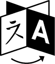
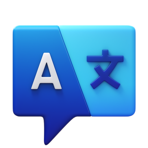
What you need is some sort of universal icon that everyone will be able to figure out the meaning of, even if they’ve never seen it before. This can either replace text such as “Select a language”, or supplement it, whether outside the field or part of it. There have been a number of attempts at this, none of which have proved so successful that they have been widely adopted.
Some attempts

The “turnstile” (revolving door) design was created by Farhat Datta in 2012. There is a whole webpage dedicated to worldwide adoption of this icon! My problem with it is that a revolving door doesn’t mean much to me in the way of translating languages — if I had even recognized it as such (I didn’t), I would have thought it a portal or entry into something. The one-way arrow doesn’t help me, either (yes, these doors usually do rotate only in that direction, but what of it?).

This design (from https://icons8.com/icons/set/change-language) has many variations, including the two characters in separate speech bubbles, or on a folded ribbon. One character is a Latin “A” (“G” as used by Google) and the other is a Chinese ideogram. Assuming that any user will recognize that the ideogram is just a sample, and not get sidetracked wondering what it is, this might work. Without two-way arrows, though, it may not shout out “Languages!” to a user, especially in the folded-ribbon form.
Bad ideas
There are a number of icons used for this purpose which I find problematic:
- National flags. These usually do not represent a single common language across a country. They are also fraught with political and nationalistic sentiments and emotions. For instance, to give the U.S. flag for “English” could easily offend the British (after all, they invented the language); using a British flag may or may not offend a Yank, but surely will offend an Irishman! Stay away from flags.
- Country codes. Most people will not know a country code from their elbow, and besides, it’s no more specific to a language than a national flag. Avoid them.
- Language codes. Whether two or three letter codes, the biggest problem is that most people will not know the language code they’re looking for. Also, being in the Latin alphabet, they may not be all that readable by people who don’t normally use that alphabet.
- Globes and maps. I find it confusing to be offered a map or a globe — it just seems to have little connection to a language selection. It would be fine for picking a geography for some nation-specific aspect (e.g., currency, or available products), but it says nothing about a language. Perhaps if these icons had become established long ago, I might be used to them in this context.
- Speech bubbles. Many attempts at a universal icon seem to employ speech bubbles (a square, oval, or ellipse with a pointed tail coming out of the corner or bottom). My problem with these is that I immediately think of something audio-related, such as voice input or synthesized speech, especially if there is also a head or face of someone who appears to be speaking.
- Too complex. Remember, these things need to be shrunk down to not much larger than normal text, and a lot of detail can disappear. Keep the icon simple!
All content © copyright 2005 – 2025
by Catskill Technology Services, LLC.
All rights reserved.
Note that Third Party software (whether Open Source or proprietary) on this
site remains under the copyright and license of its owners.
Catskill Technology Services, LLC does not claim copyright over such software.
This page is https://www.catskilltech.com/utils/show.php?link=user-interface-issues
Search Quotations database.
Last updated Wed, 31 Dec 2025 at 10:38 PM

